SmileDirectClub
Creating a design system from the ground up during a major replatform was no easy task, but it was one that I was happy to lead.
SmileDirectClub's website architecture was outdated and a huge hinderance to designers, developers, and project owners across the company. Due to a variety of limitations, the divide between design handoff and implementation left something to be desired.
We needed to modernize our approach to design and create cross-team alignment on how design and development should happen at SmileDirectClub. Under the leadership of the Director of Product Design, I spearheaded the design of a comprehensive design system.
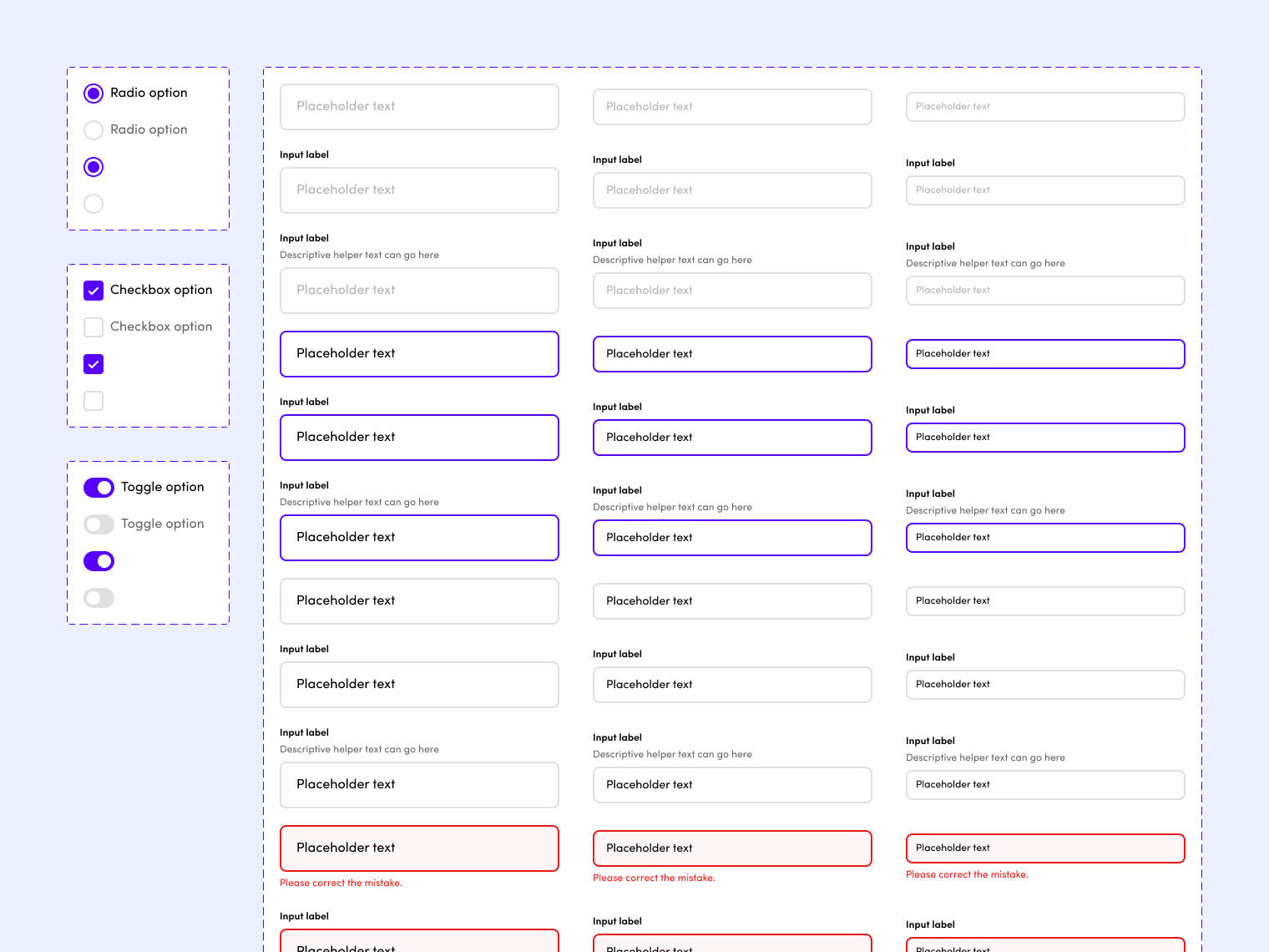
I honed the visual design, defined interaction patterns, created organization-wide Figma libraries for foundational styles and complex components, and created best practices, usage guidelines, and how-to videos to give other designers the awesome power of designing systematically.
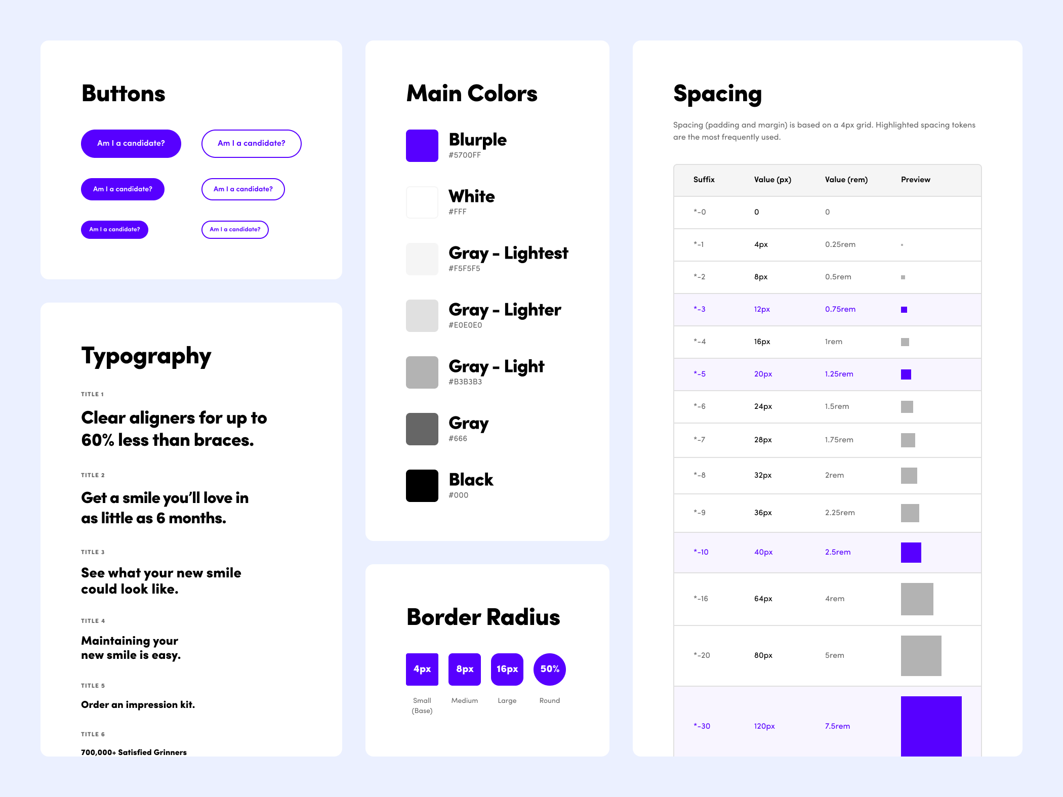
I worked closely with my developer counterpart throughout the process, and together we made sure that styles and components represented in Figma were also represented in our front end UI library.
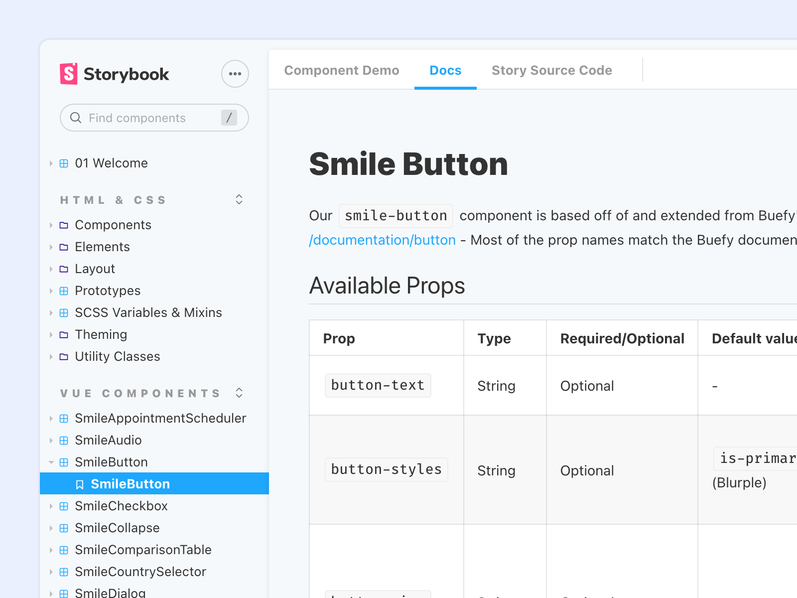
While this work is in the process of being implemented, our efforts have already increased design and development efficiency, created a consistent visual language for SmileDirectClub's web presence, greatly improved the user experience of their website, and enabled fast, consistent scaling of design as SmileDirectClub grows.
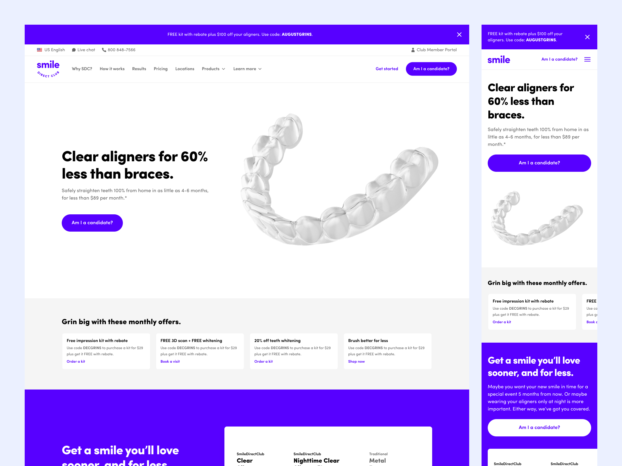
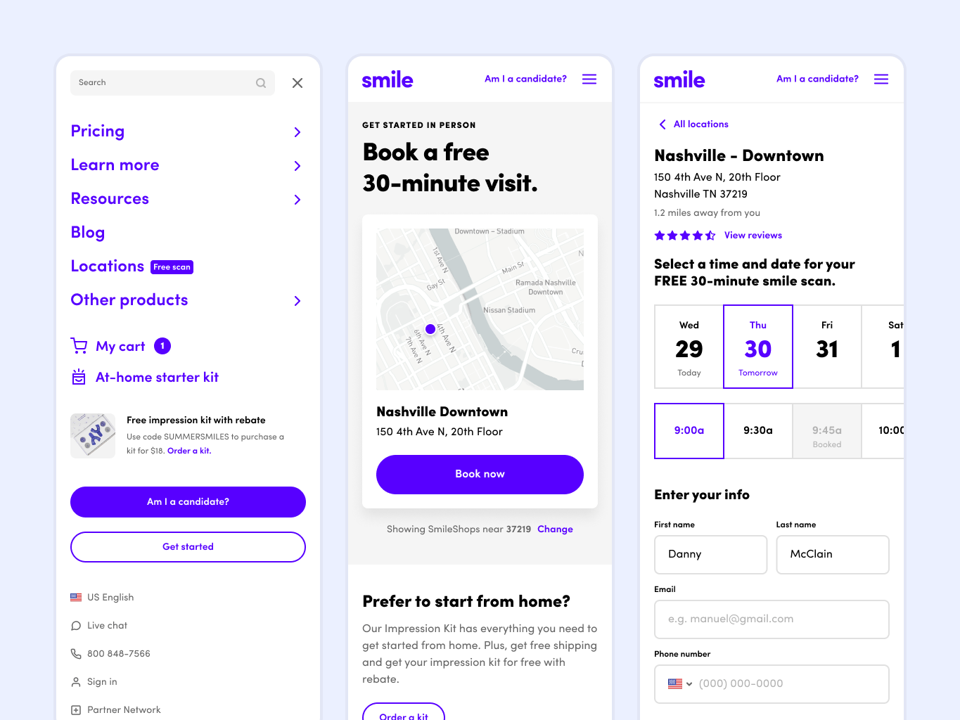
SmileDirectClub's design system was my most recent focus, but during my tenure at SDC, I was also the design and UX lead for many high-impact, customer-facing initiatives. A few notable projects I worked on:
- The first iteration of the SmileDirectClub iOS app* (including research, user flows, testing, and visual design)
- The web interface for SmileDirectClub's partner network, which allows dentists and orthodontist to prescribe SDC's clear aligner treatment to their patients
- A complete overhaul of user flows and visual design for getting started with SmileDirectClub (finding a location and booking a visit or ordering an at-home kit)
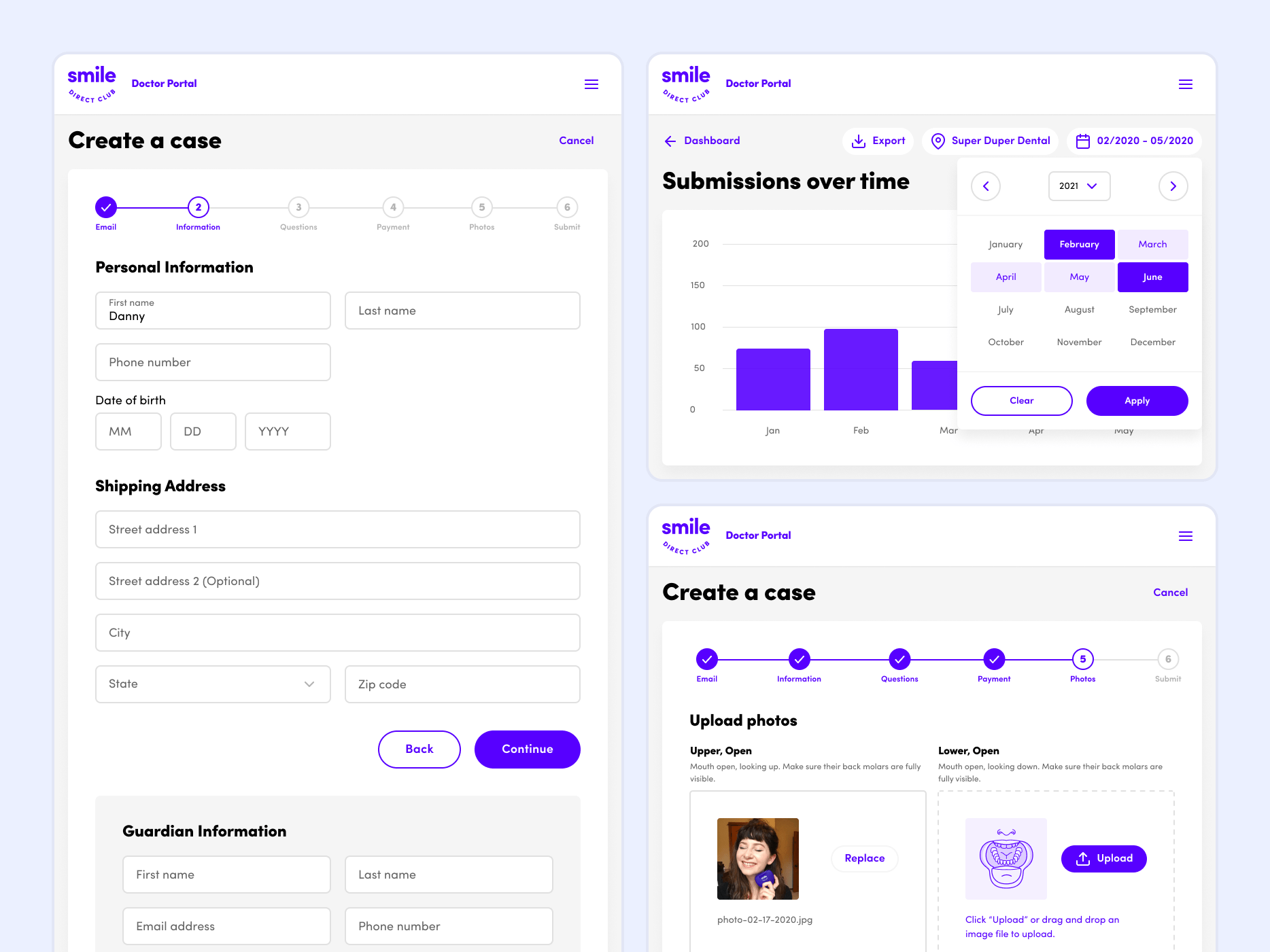
While it's impossible to articulate my every contribution, as the second member of our team (under the fabulously talented Bryan Kemp) I played a key role in shaping the growth and culture of the team and had a huge impact on setting quality standards for UX design at SmileDirectClub.
“I LOVE the components, it makes everything so much easier”
“I really can't thank you enough for setting all of these up! It has been SO NICE to work with these!!”
“The design system is DOPE!!!!!”
“Team member shoutout today goes to Danny McClain once again for making our lives easier”
Email me if you're looking for a detail-oriented designer to bridge the gap between design and code and keep files, styles, and processes tidy.